What are the must have colors for miniature painting?
At Redgrass Creative, we are very lucky to work with a lot of the world’s best miniature painters. When they are not busy with wonderful paint jobs, we asked them about what they consider the most important ‘must-have’ colors for miniature painting. We had a real wealth of responses, some classic and some very surprising.
At the start of a new year it is normal to reflect on what we would like to do. And this is no different amongst hobbyists. With that in mind, we have collated some color ‘top picks’ from our pro painters so we can all make sure we are using the best colors for our minis. Our deepest thanks to all the painters who took the time to answer so thoughtfully for this article.
At the end of this article we would all love to hear your color ‘top picks’! Then check out our free painting book by Angel Giraldez for more inspiration!
Our first pick in the list of most important ‘must-have’ colors!
Many of our painters chose dark blue-greens for shadows – you can use a very dark blue-green to create shadows on cloaks and cheeks instead of pure black. Dark blue-greens can ‘shift’ which makes them very versatile in recess shading both blue and green objects, whereas black could leave things looking too flat.
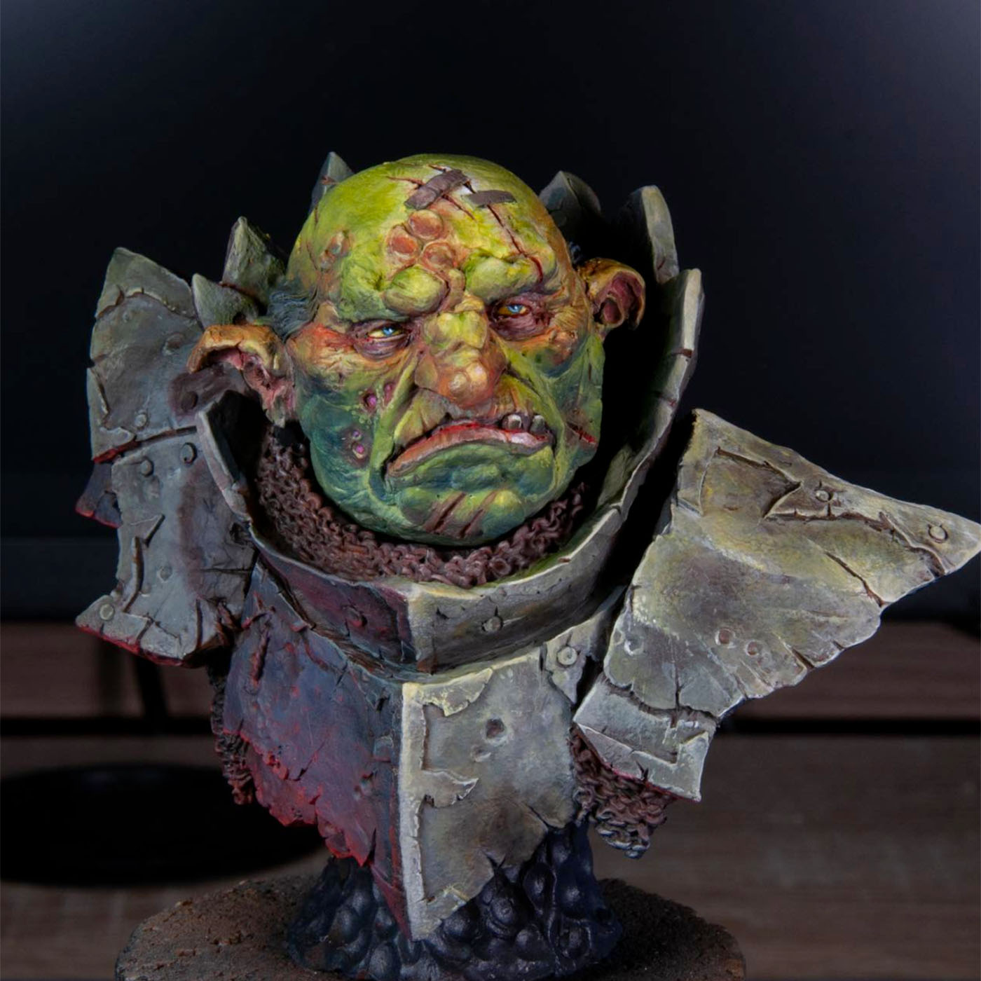
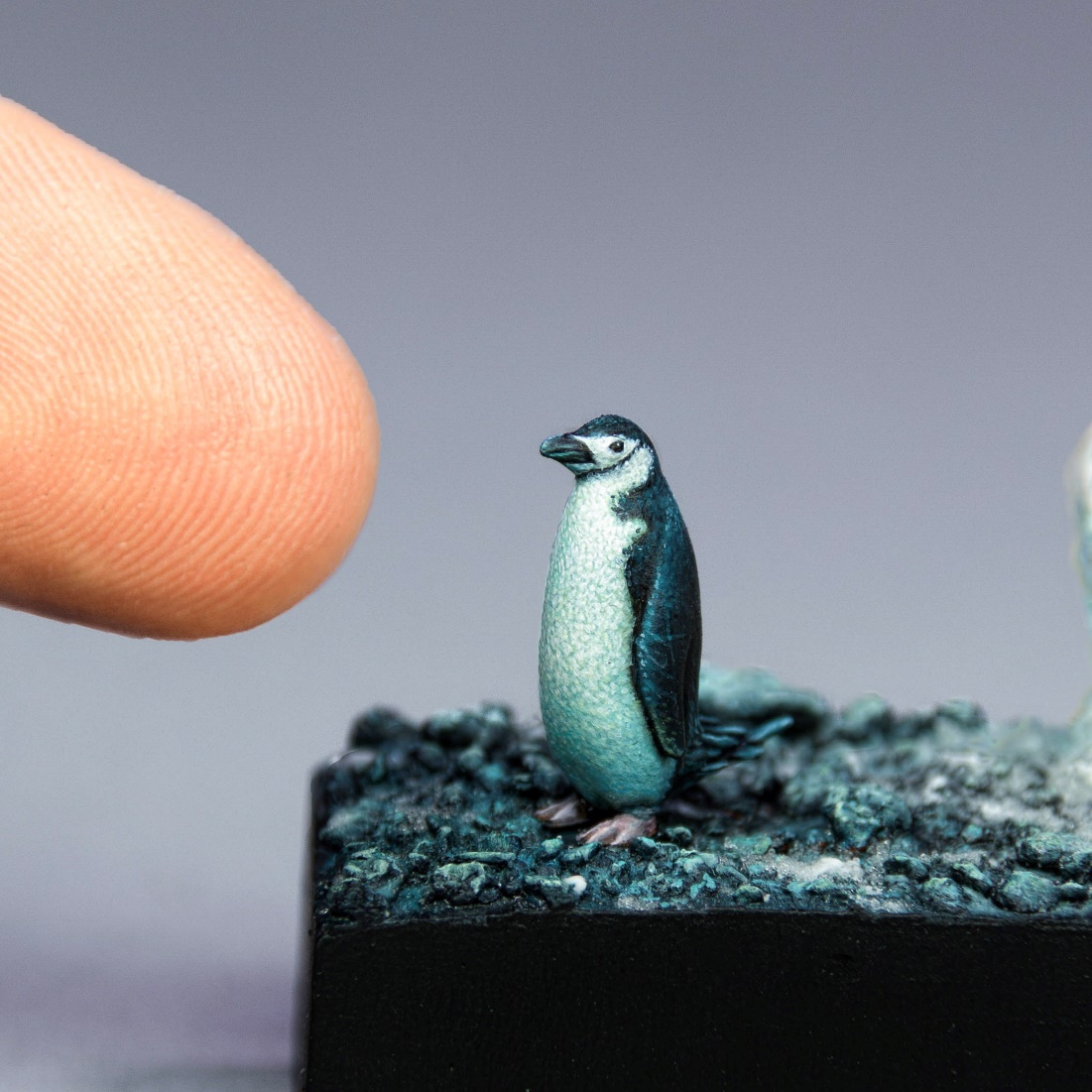
Lil Legend said it tops his list- not a surprise to his students! Another added benefit of owning a color like Dark Sea Blue was how much easier steel NMM is to achieve when using it along with white.
This is a deceptive but very useful blue that can be pushed toward blue tones or toward greens. It is a staple in my non-metallic metal [as seen above], in enriching shadows and mixing with other colors
@Quarterpaint
Many of our painters love magenta, especially when it came to adding vitality to your skin tones.
It’s an essential glaze for warming flesh in comparison to the blue-green shadow tones. Zumikit0 is particularly a fan! Without the magenta for balance, skin could run the risk of looking too lifeless. So unless you’re painting undead skin, definitely consider including it. Given the rise of cyberpunk colour schemes, a good fluorescent magenta is vital. Trent Denison from BigDenoPaints also suggests using magenta for depth of shadow to your greens!
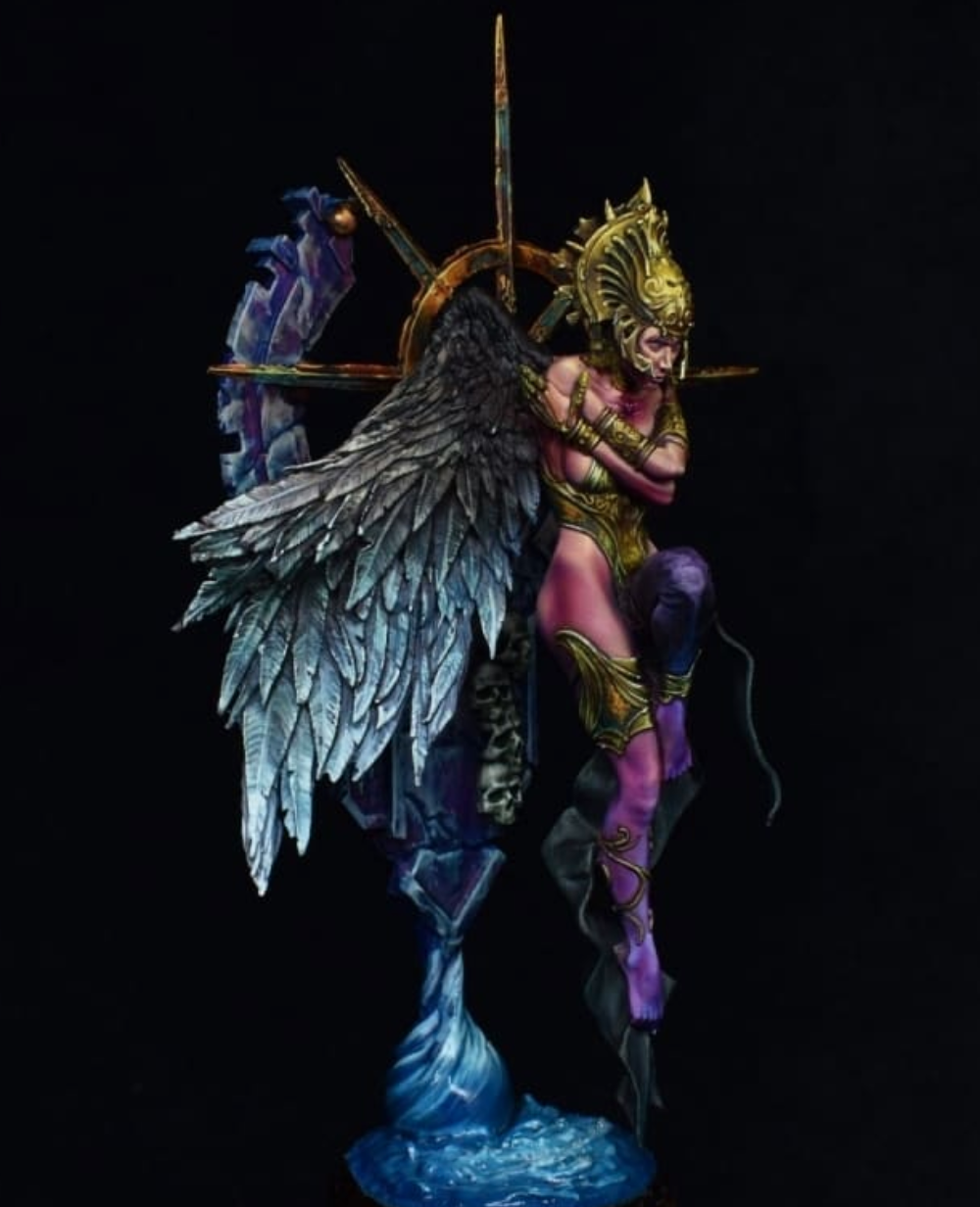
“Having a colour that creates a vibrant contrast is important for my style of painting, and nothing has more punch than a vibrant magenta. It can be used in skintones to create more nuance, to add depth of shadow to greens, and can create a very intense point of colour to draw the gaze.”
@bigdenopaints
This choice was almost universal for most important must-have colors!
The main reason is that it makes a better highlight color in most situations as opposed to pure white.
Adding white to a mix in order to ‘lighten’ the color, in fact just desaturates the end result. But a pale yellow can lighten most mixes for highlighting without desaturating. This makes it an ideal choice when you want to lighten skin, rather than reaching for the white. It has a realistic warmth which makes it ideal for objects being highlighted by natural lights and for your OSL experiments.
It is no surprise then that it turns up in Angel Giraldez’s videos as a favoured color!
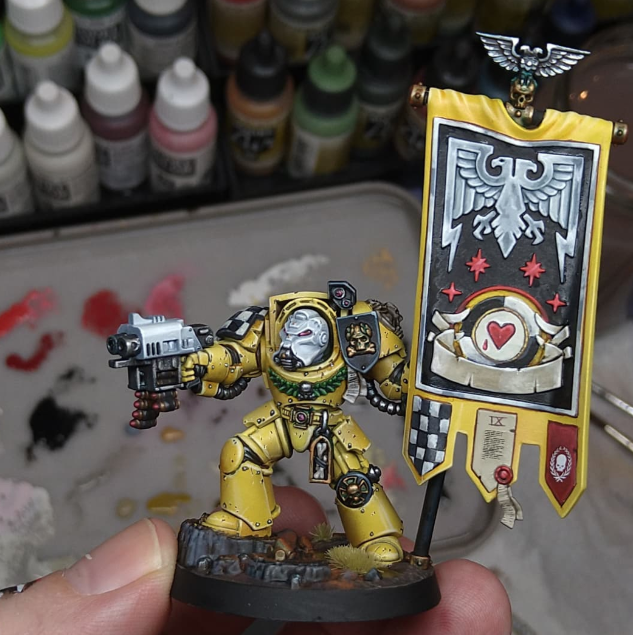
[It's] a good color to mix in other paints for a warmer value. But this one is good with flesh and the best highlight for yellow paints. Perfect for the last NMM gold highlight too.
@warpstormpainting
Who doesn’t love red? It always features in most important ‘must-have’ colors. It is emotive and turns up in many color schemes.
However, as a primary color, red is notoriously difficult, because of the confusion on what colors to use when highlighting red. If you add white, then the highlight will become pink but if you added yellow instead it will become orange. The best advice is to start with a good quality red that is already very saturated, like a Cadmium Red.
Crimson was also mentioned a few times by our painters as a must-have dark red, so that is also worth considering. David Paz was keen to promote crimson reds, and notes that a paint job with good reds denotes your mastery of miniature painting!
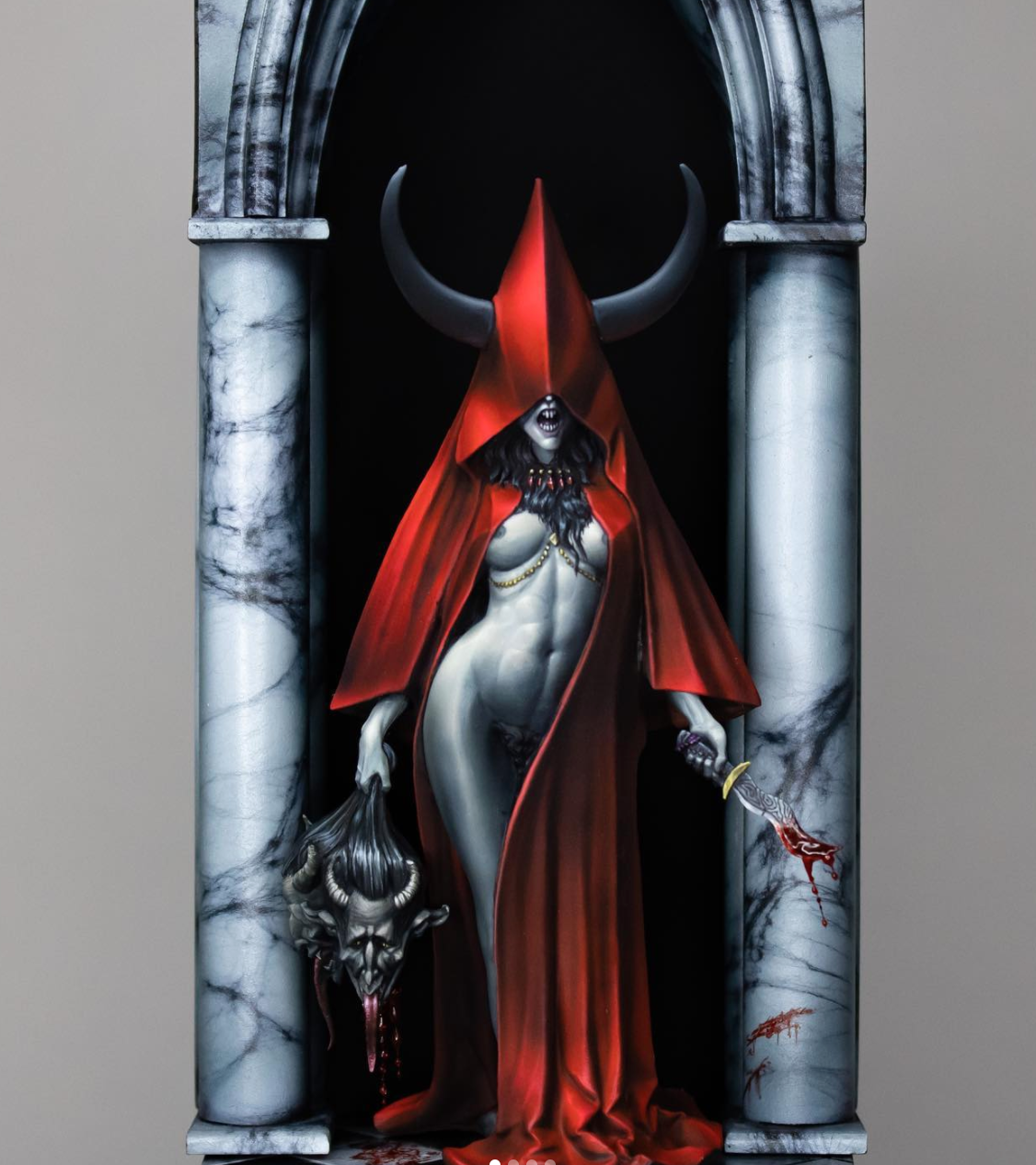
Red can be a difficult color for some people to paint. To get a vibrant red, you need a vibrant, saturated red paint ...so it’s important to start with something already at maximum saturation. Cadmium Reds are beautiful, but toxic- don’t use these if you have a bad brush licking habit!… Personally, I believe that you can’t have too many reds in your collection
Will Hahn
Black is a color choice that many of our leading painters urged hobbyists to move away from using too often. With shadows, dark blue-greens were preferred along with as well deep purple or violet.
Black definitely has its uses though! In the right context, a must-have black is essential and often an off-black was the black of choice, e.g. Payne’s grey, Coal grey, or Corvus black. Electric Eve likes to use them to add extra dimension to leather work because off-black is softer than pure black. As with the advice on black, many of our painters said something similar about using pure whites.
I look for a good deep black which hasn’t got a harsh tendency to green or blue… I normally own a matt and a glossy one to use on different occasions. With the matte black I usually prime and paint my wooden plinths black at the end of a project. The satin or glossy one I use in the deepest shadows because they often look darker then matte… For me a good white needs to have high pigmentation. I want to paint it in the highest highlights reflecting dots of light basically. This is why I want it to be opaque with the first brushstroke even if it is diluted.
Josua Lai
Our final most important ‘must-have’ color, it is time to give a little love to brown!
A very earthy color, it can be warm, but it’s also associated with decay and waste. Despite chocolate, brown is never high on people’s list of favourite colors! However, to miniature painters, a good brown is a must-have. A good brown should be in everyone’s paint rack and is incredibly versatile. The stand out nomination was for dark, rich browns like Burnt Umbers, for example. They make great base colors for leathers, wood, and skin tones. They are also invaluable in weathering your models.
A close second was a good orange or red brown. Craftworld Studio also made a good case for browns as a wonderful glaze for their students to use!
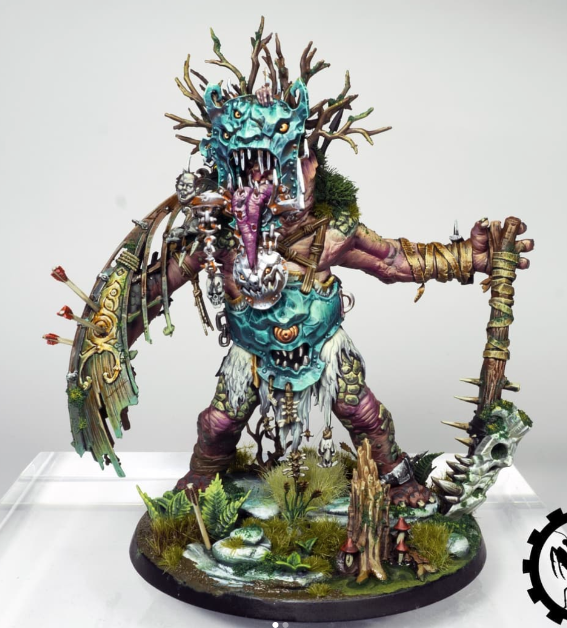
I can’t made a list of colours without talking of Rhinox Hide, I use a lot of browns and leather colours, but I think Rhinox is my favourite so far, is a dark brown, with a really nice consistency to use on the bases of the miniature, and it’s useful for leathers, skins, robes, capes, hair, etc… Is so deep but at the same time still having a bit of colour, which helps you create nice contrasts without losing all the details in the shadows… that’s why, as a mainly fantasy painter, it is always on my table.
CHK Minis
Wrapping up, it’s fascinating to see what the pros swear by, from dark blue-greens for shadows to lively magenta for skin tones, and even the underrated importance of a good brown. These color tips are pure gold whether you’re just starting or have been painting minis for years. Give these colors a whirl in your next project, and let’s keep the conversation going – we’d love to see what you create.
Happy painting, everyone!